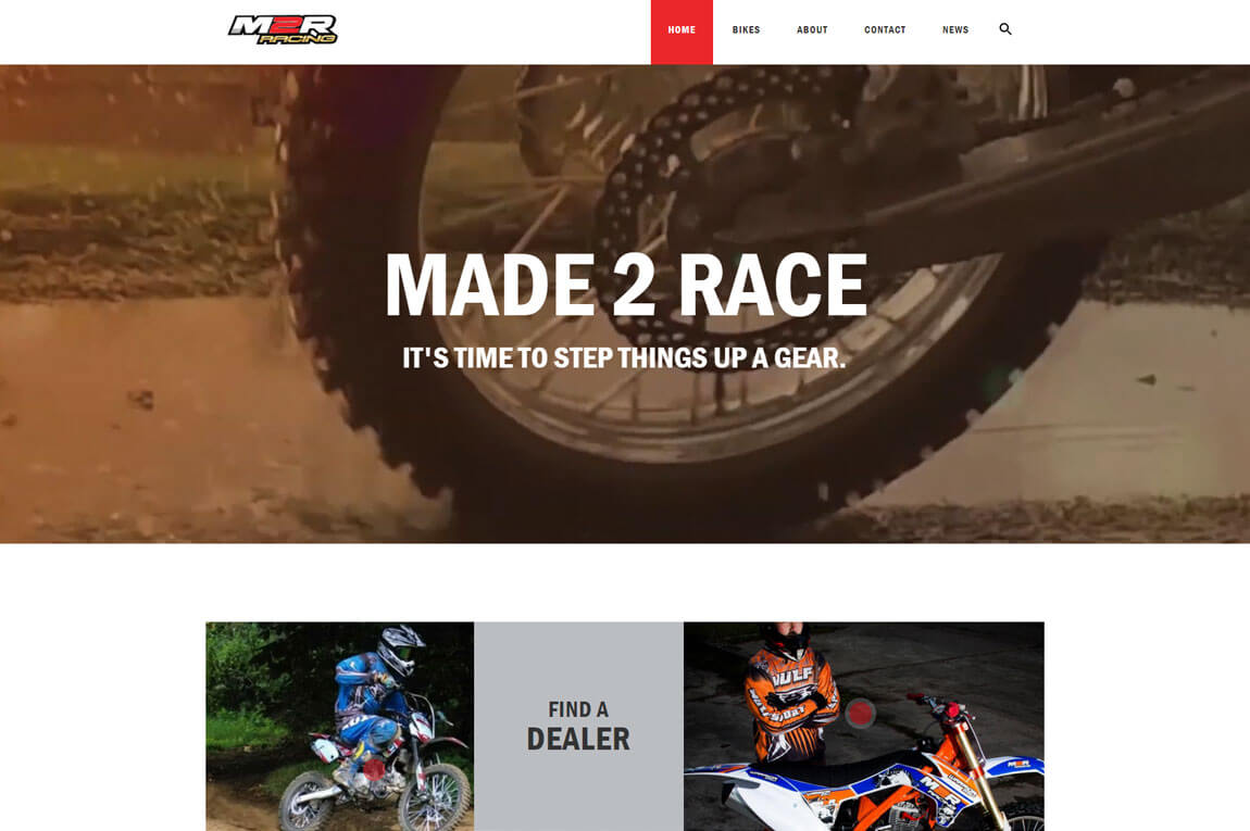
As the design of websites evolves over the years, it’s only natural to want to keep up with the latest trends. The Made2Race website has had a couple of fresh new looks since the first day it was designed. However, it’s most recent re-design is certainly a game-changer.
Back in the earlier days of the internet and websites, it was common to find web pages filled with content alongside some classic drop shadowing and quirky visual effects. However, as we rapidly approach 2020, things have changed a ‘little’.
The trend of modern websites today is to be more sleek and simplistic, while still conveying your brand’s unique identity. Afterall a cleaner website does offer users a much easier experience overall!
This modern trend really does shine through in the redesigned M2R website…
Almost unrecognisable for its predecessors, the new face of M2R echos a modern, sleek style, while maintaining that all-important impact of product visuals. The clean and crisp style make navigation seamless while also offering users with a more interactive experience.
The use of video banners is becoming increasingly popular across the board for eCommerce websites, as it allows you to showcase your brand and products to potential customers. This really steps things up a gear for M2R.
See it for yourself by visiting their new website today – be sure to keep an eye out for the racing mouse!
A Little About M2R
For the last 20 years, M2R has been researching and developing market-leading Pit and Dirt Bikes, as well as Supermotos. Their ethos is to deliver quality products that are also affordable and fun!

